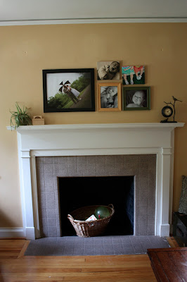
it's about time for some photos of our new house, so here is a little tour of the living room and kitchen.
LIVING ROOM
pros:
- fireplace with mantle (it even already has four hooks for our stockings)
- wall color (it was already here and i like it. we haven't painted and won't paint any of the walls...too much work)
- wood floors
- two new windows in the front of the room
- window on front door very similar to window on front door at our old house
cons:
- two really old and dirty windows
- the place where we have seen the most cockroaches
- no keys to the front door
- fireplace that jobot frequently walks into and bumps his head on
overall thoughts:
i really like this room. it is where we spend most of our time. arranging the furniture was a challenge, but i think we figured out a good set up. the two chairs by the front windows are perfect places for reading (except when it is dark...we need another light on that side of the room!), the couch is perfect for snuggling, and the floor is great for playing (though a rug would be nice).
KITCHEN
pros:
- nice space above stove to store spices and cookbooks
- window above sink with a view of our street
- nice little window sill above sink
- garbage disposal, ice maker, and dishwasher
- plenty of outlets
- cute curtains (recently sewed by me)
- lots of cupboard space
cons:
- awkward and crowded space by table/back door (difficult to navigate with two kids and a bag)
- garbage disposal switch at perfect spot for jobot access (covered by the neon pink tape below the sink. seriously...who thought that putting the switch there was a good idea?)
- no dining room (i really miss having a dining room)
- lack of natural light. room is usually quite dark and the red paint doesn't help.
- a big, blank red wall (we don't have anything to put on it!)
- cupboards/drawers are difficult to open and close
- love's bedroom is right off of this room (narrow door by table is hers)
overall thoughts:
this kitchen is okay. the arrangement of the cupboards/counters/appliances make it very practical to work in. to me it feels crowded and dark. not my favorite, but it could be much worse, and i am thankful to have a functional kitchen.
we are slowly making this house into our home. stay tuned for photos of the other rooms. for the post about how this house came to be ours, click here.


No comments:
Post a Comment